Graphic language has always been present throughout our lives as a way of representing reality.
Since the arrival of the first personal computers with integrated GUI such as the Macintosh 128K in
the mid-80’s, going through versions of Windows or even the current Android 10 and iOS 13 in
smartphones, they have used graphic interface elements that allow us to understand and interpret
in a simple way what is the result that we will get when interacting with such an element.
But… what is Neumorphism?
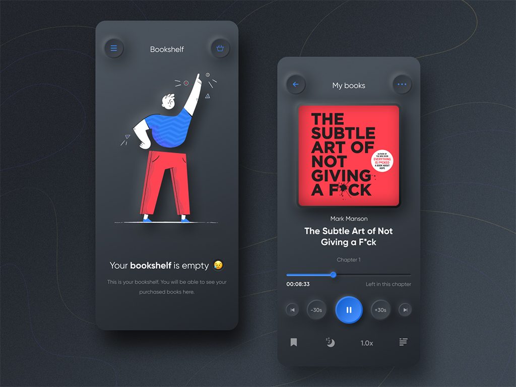
Neumorphism seeks to give a flat appearance with light and shadows, including textures and depth
in its buttons that achieve realism. It seeks to give the user elements of a graphical interface that
resemble everyday objects at their best and we are no longer just talking about icons, but elements
such as cards, buttons, sliders or any type of affordance in which these patterns can be represented
of design.
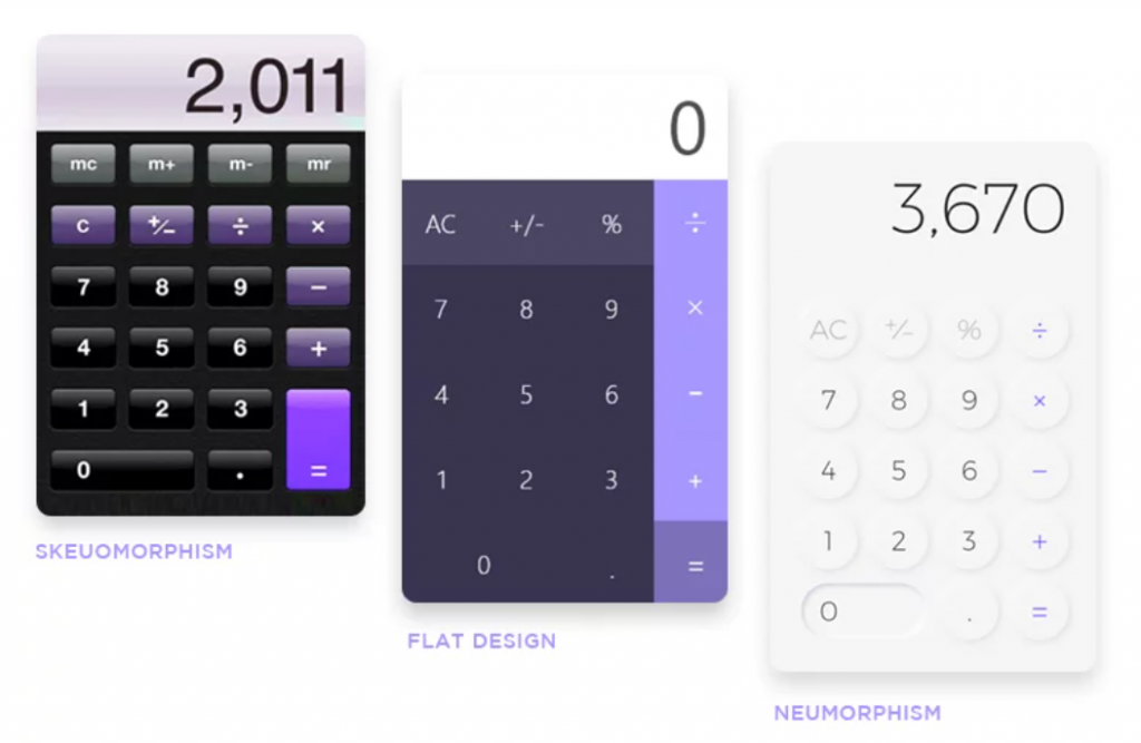
This style is mixed together with minimalism and skeuomorphism, although skeuomorphism
characterizes by imitating the physical world and neomorphism only tries to use a flat appearance
fused with minimalism.
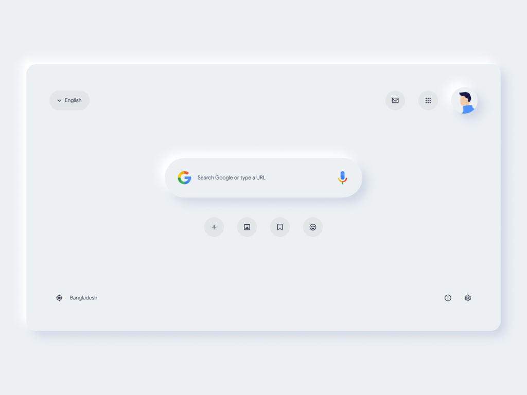
This trend can innovate the use of many applications or websites, making them super attractive to
users. The neomorphism has such a minimalist design that it makes it look nice, clean and with only
the objects that are necessary.
Where is neumorphism already applied?
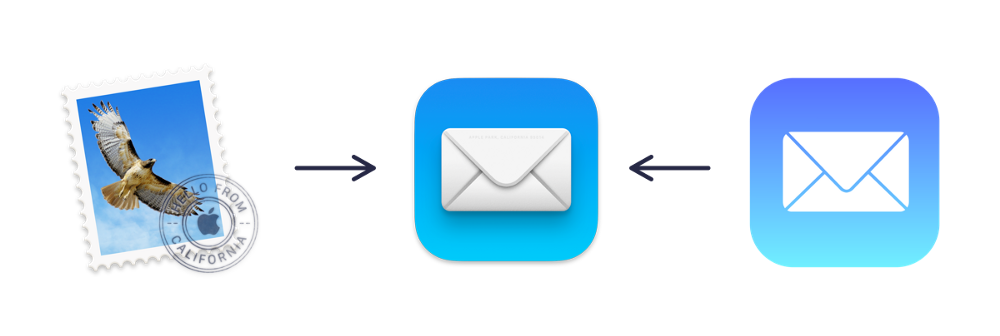
The next new update for MacOS Big Sur will bring with it this new trend in the redesign of its icons,
as it did in its interface with iOS 7 back in 2013, setting a standard before and after in the history of
design.
This is how we have gone from a flat design to one with more shadows and lights, giving a more
realistic and colorful appearance to feel more comfortable with everyday digital objects.


